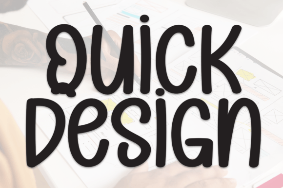
Quick Design: A Handwritten Display Font for Digital Branding
As a web designer working with small creative businesses, I’m always on the hunt for fonts that add personality without compromising usability. Quick Design immediately caught my eye as a charming, handwritten display font that brings warmth to digital projects. I recently used it on a boutique coaching website redesign, and I’ve been impressed by how it elevates the brand’s online presence while maintaining clarity across devices.
Bringing Personality to Web Headers and Hero Sections
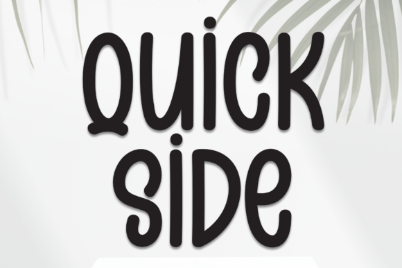
One of the first places I tested Quick Design was in the hero section of a landing page. The client runs a mindfulness coaching platform and wanted a soft, approachable feel. I used Quick Design for the main headline overlaid on a subtle watercolor background. The font’s gentle curves and natural rhythm gave the page an inviting tone that felt human and trustworthy.
It worked beautifully at larger sizes—especially in the hero banner where it served as the main focal point. The font’s open spacing and soft baseline variations gave it a handwritten charm without looking overly cursive or difficult to read. On mobile, it scaled down gracefully, maintaining legibility even on smaller screens.
Perfect for Branding Moments, Not Body Copy
Quick Design shines in short bursts—think headlines, callout text, logo treatments, or branded section dividers. I used it for a “Welcome to Your Journey” greeting on a course sales page, and it created a warm, personalized feel that standard sans serif fonts often miss.
That said, I wouldn’t recommend it for body text or long-form content. It’s a display font through and through, best reserved for moments where you want to inject character and emotion. For supporting text, I paired it with a clean sans serif like Lato, which created a nice visual rhythm and ensured readability across the site.
Responsive Design and Readability Considerations
I tested Quick Design across multiple breakpoints to ensure it remained legible and visually consistent. On desktop, it looked stunning in bold headers. On tablets and phones, I made sure to avoid using it for anything smaller than 24px to maintain clarity. When used over images, I added a light semi-transparent overlay to ensure contrast remained strong.
One thing to keep in mind is that decorative fonts can sometimes render inconsistently across browsers and devices. I tested it on Chrome, Safari, and Firefox, and found it held up well. Still, I always recommend previewing the font live before committing to it in a production environment.
Font Pairing for Visual Harmony
What really made Quick Design stand out was how well it played with others. I paired it with a minimalist sans serif for subheadings and body copy, which grounded the design and balanced the whimsy. For a boutique client, I even layered it with a light serif font in testimonials to create a soft, editorial vibe.
If you’re aiming for a more modern look, try using Quick Design for your logo or navigation menu and pair it with a geometric sans serif for content areas. This combination keeps the design feeling fresh while maintaining a clear visual hierarchy.
What to Check Before Using Quick Design on the Web
Before launching the site, I double-checked the font’s licensing and webfont formats. Quick Design came with standard web formats (WOFF, WOFF2), which I uploaded to the client’s hosting platform. It also included multiple weights and ligatures, giving me flexibility for different design elements.
If you're using it for a client or commercial site, make sure you have the appropriate license. Also, keep an eye on performance—decorative fonts can sometimes be heavier than standard web fonts. I optimized delivery using subsetting and only loaded the weights I needed.